Manchester United don’t exactly have an exemplary record in being resourceful with shorts and socks of complementary kits, which can be dated as far back as the 1950s.

In that instance, a white change strip appeared during the tail end of the 1956-57 season, featuring red-trimmed bottoms. When the home already had plain white shorts, their addition to the laundry hamper seems a bit redundant although they did get mixed up at times, usually in the European Cup.

The home’s default stockings were the iconic black pairs with a white band cutting through the red turnovers but come 1959-60, plain white became the standard choice. Now the home and away had same-coloured legwear by default, in different styles.
This practice toned down later on in the 1960s and wasn’t a problem Admiral had, when United left Umbro for them in 1975. During this time, black socks were seen with the blue third kits too but them featuring that shade rendered them incompatible with the other uniforms.


Come Adidas’s first stint in 1980, they typically gave the home shorts red stripes and the change white during the early years of the deal.
That may be all well and good for the alternate garment’s Three Stripes to not jar with the respective tops but it seemed too excessive, especially when there was only one style of black socks available, which had red tops containing the white stripes.
Umbro’s second coming in 1992 didn’t see a white kit until four years later, which was a contingency measure after the previous season’s grey one of 95-96 got panned not even halfway through its lifespan.
These new outfits for 96-97 were fully interchangeable, negating the need for the bespoke palette swaps.
That harmony only lasted one season, played in part with the new away for 1997-98 being in another template and the crest having a different-shaped mount. At least it didn’t have its own black socks, using the home set when needed be. Just don’t mention the European home kit bringing its white bottoms to the party.

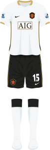
When Nike took the reins in 2002, they used the club’s traditional colourways for the two change strips — first-choice in white and second in blue.

As with the home’s standby pairs, the away’s shorts and socks were respectively black and white. Unlike with Adidas two decades earlier, unpleasing aesthetics with the trim couldn’t be used as an excuse so having an extra set was pretty much pointless.
To compound things further, the away socks had a big black panel on the rear so at times — not even out of necessity — the home back-up ones were used instead.


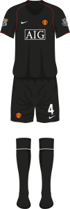
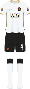
2003-04 saw two new change uniforms launched again, now one in black instead of blue. This could have brought about the same issue but it was averted by them being swappable between each other.
Granted, the retained home components could work with the white third but due to its lack of red, not so much with the black away. As much as we’d love to see three-way interchangeability, we’ll allow it.
But when United do become resourceful, it doesn’t have the desired effect some of the time. It is nice to see the effort put in but is it worth it for that jarring aspect?
This issue typically arises when a strip is retained but a part of it is updated with the new season’s wears. The 2006-07 change was kept on for another year, though the shorts were discarded, instead using the new 07-08 set.
Despite the different template, the black with white hem fitted very well but for one minor detail; the crest mount was a different shape.
The initial shield — in the shape of Brazil’s badge incidentally — was used for the one season whilst the next one was used for four, seeing three Premier League titles and a Champions League triumph out of three Final appearances.
Perhaps keeping on the 06-07 mount for one more campaign could have fixed it but that would have left its gold keyline out of place, or perhaps update the crest on the third shirt but that would defeat the point of retainment. Sometimes you can never win.
2011-12 had a similar situation, the carried-over third used that backing whilst the new strips got rid of it completely on the player outfits, in favour of a large heat-pressed emblem. The alternate home bottoms could have worked despite the inconsistency but instead, the entire uniform was kept on.

The following year’s away had gingham-patterned tonal shorts, matching the home top that had the design all over it. It also had a black-and-white crest, making the entire ensemble only feature three colours.
Its and the back-up home socks were similar, save for the black turnovers here. The home jersey had a black neck so these wouldn’t look out of place there, although a wardrobe malfunction meant that Patrice Evra worn them at Newcastle United whilst his teammates had the plainer stockings.

White shorts were needed in the Champions League but instead of having their own dedicated pairs, they instead used the home that featured a jarring full-colour badge.
It was also the last ever United kit to have a two-season lifespan, unless you want to be pedantic and count the 2020-21 home being used in the latter stages of the previous Europa League campaign that got delayed by COVID-19.
So next season, the gingham theme remained; printed on the underside of the collar on the home and much bigger all over the away top. So would this mean all three kits would feature the pattern? You bet they didn’t!

For some reason, it was decided to bin the old shorts and instead use the home’s standby set again with a coloured crest. Bizarrely, the socks were kept on when the new ones would have worked too.
In the first outing of the strip for 13-14, the under-17s did use the white home socks in the Milk Cup, making you think that would be the style from then on. Being in all-white against Cherry Orchard, one can forgive the mismatching badge on the right leg.
Nike did the dirty by deciding to ditch the heat-pressed crest and use mounted ones like with the replicas, making them conflict further. It didn’t affect the third shirts though.

Compounding things further, the change had its own bespoke white shorts that had a two-tone badge in navy blue and white. Black could have worked there as the shade features on all standard and alternate components of it.
The opportunities were there to make the three outfits harmonious, all having the same white socks at their disposal, but they were missed.
With money talking more now by ridding the concept of kits lasting for more than one season, it’s unlikely we’ll see phenomena like that again. Having multiple components containing the same colours and trim remains a recurring theme, like with the first lot of socks from Adidas’s return, in 2015-16.
The less said of 2021-22, the better.
